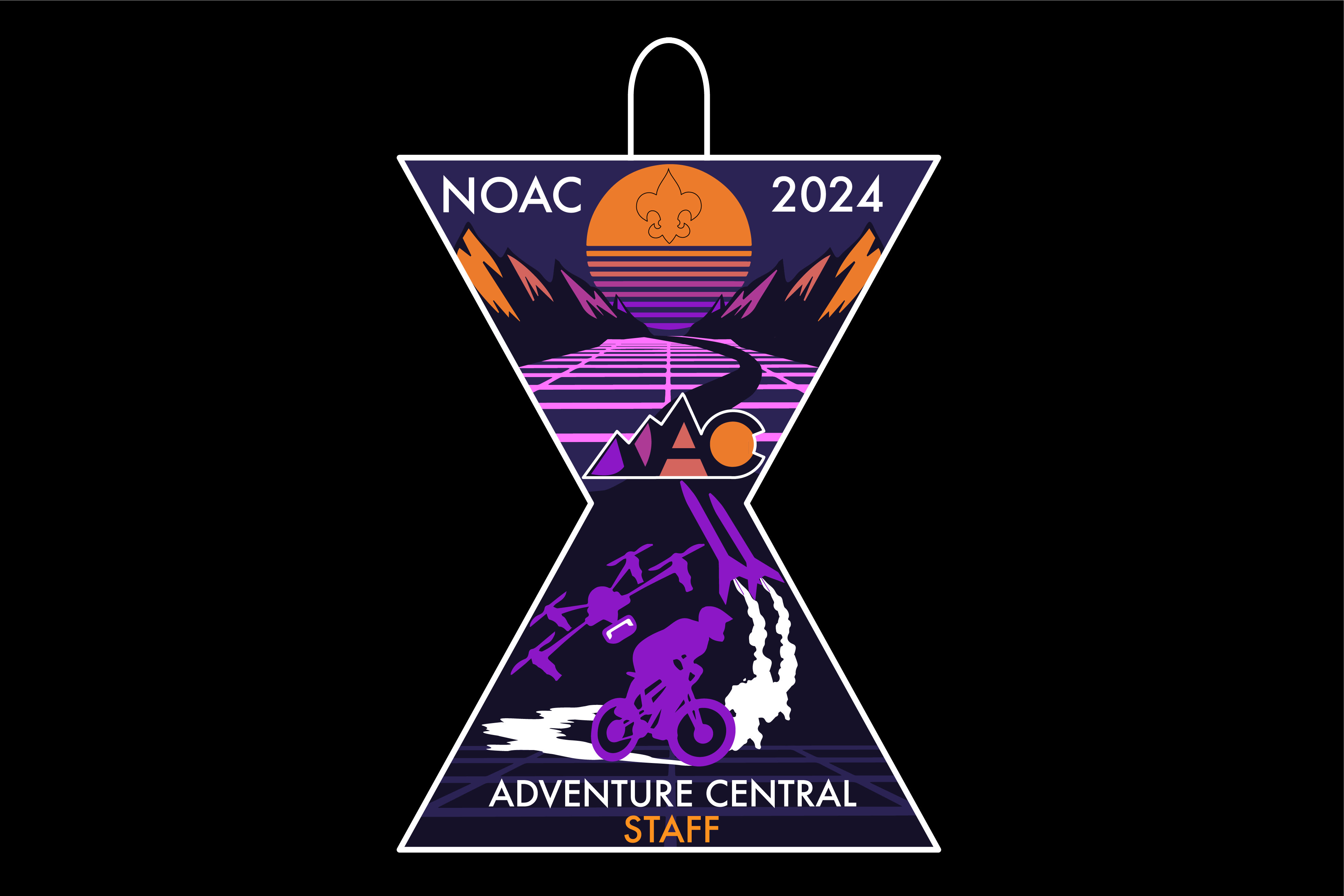
For this third blog post, I would like to show you how I work with organizations and iterate on designs.
For this project I was approached by the leadership of an organization that was planning a 6000 person conference to be held in the summer of 2024 to design a patch to be worn by staff as an identifier. The patch needed to represent a certain area of the conference named “adventure central.” Adventure Central is home to most of the fun events and attractions to be held at the conference, such as BMX and White Water Rafting.
Now, going into this project there is the problem of Risk. This patch is going to be seen by thousands of people and used commercially as a fund raising asset. This level of design is something that I am Unfamiliar with, and so I’m definitely feeling a bit of anxiety and excitement about this project.
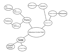
The creative strategy I elected to use for this project is a Mind Map, writing down aspects I know I want to include and linking sub-aspects that tie in. I didn’t need to go to in-depth before being inspired enough to start putting pen to paper. I won’t go show each and every step, but I will show you the iterations and changes that were proposed.
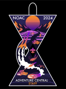
For the first iteration of the patch I had completely free range with very little previous reference to go off of. I chose a striking color pallet to mix with the theme of “90s Synthwave” that I chose to represent certain aspects of adventure central. I was experimental with the silhouettes and shape of the patch, only hoping that both were acceptable.
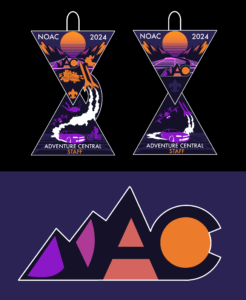
After feedback from the leadership telling me to simplify the silhouettes in the patch, remove the gradient, and remove the tank, I came up with the next two iterations that I wanted to share with them and see which they preferred. I was also told to create a logo for Adventure Central, something that can be used to easily identify the program when it comes to signage. For the logo I was inspired by the Colorado flag and mountains.
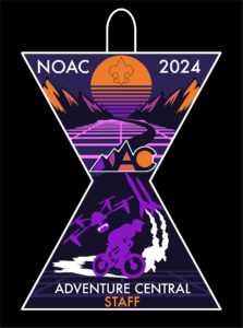
For the last pieces of feedback I received via a zoom meeting with the leadership I was told to increase the size of graphics so they are more legible when when produced, make the center wider as to increase surface area, and to keep the color pallet with eight or nine colors. I sent this version to them and got the go ahead, this is the final iteration.
Thank you for reading, go out and design enchantment!
-Maxxon Yocom

